DATE
16/04/2025
Empowering small business owners with data they actually understand.
A web-based analytics tool designed to simplify data for small online stores.
Web App
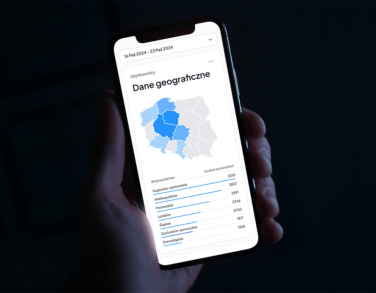
Dashboard
My role
Timeframe
Tools
Deliverables

Turning daily chaos into business clarity.
ClearCart is a web-based analytics dashboard dedicated to small e-commerce businesses. Built with clarity and usability in mind, the tool helps independent store owners transform overwhelming data into simple, actionable insights that support better decisions.
What were the
GOALS?
• Designing a dashboard that presents key business metrics in a clear and accessible way for non-technical users.
• Creating a clean, scalable interface that can adapt to different business sizes and use cases.
• Developing a product that complements the business process with an additional layer of user autonomy - without diminishing the role of internal analysts.
Project background: statistics, trends, and key points.
While e-commerce in Poland continues to thrive, small business owners often find themselves without the right tools to manage and interpret their data. With no budget for regular reporting and limited experience with tools like Google Analytics, small business owners are often left guessing instead of knowing. This project was born out of the need to create a tool that empowers these users with accessible, actionable information.
What were the
FACTS?
• Small e-commerce owners typically lack the time, knowledge, or tools to turn raw data into decisions. They need simple, visual insights, not complex dashboards.
• Business owners want to feel in control of their store’s growth, but without sacrificing time or hiring external analysts.
• There’s a growing demand for self-service tools that combine strategic insight with simplicity

User Research
After conducting informal interviews, we found that most store owners feel overwhelmed by their data and want quick answers to everyday business questions without stretching their budgets.

Requirements
The dashboard needed to present key performance data in a simple, intuitive way, helping users understand data, while working on the Google Analytics' API.

Assumptions
The assumption was made that users would value clarity, and that focusing on a few metrics would drive more engagement than offering endless filters and options.

Prototypes
Low-fidelity wireframes were created to explore the core structure, navigation, and data presentation, aiming to keep the interface clean while prioritizing real business needs.

Analysis & Iteration
User feedback led to simplifying navigation even further and adding contextual explanations to help users interpret their data without needing external help. We also introduced guided walkthroughs to assist users.

How to design analytics that speak small business? 📊
What were the
CHALLENGES?
• Balancing the need for a new product while maintaining current business processes.
• Making the interface intuitive for first-time users, with minimal onboarding or training required.
• Showing just enough data to support decisions without unnecessary complexity.
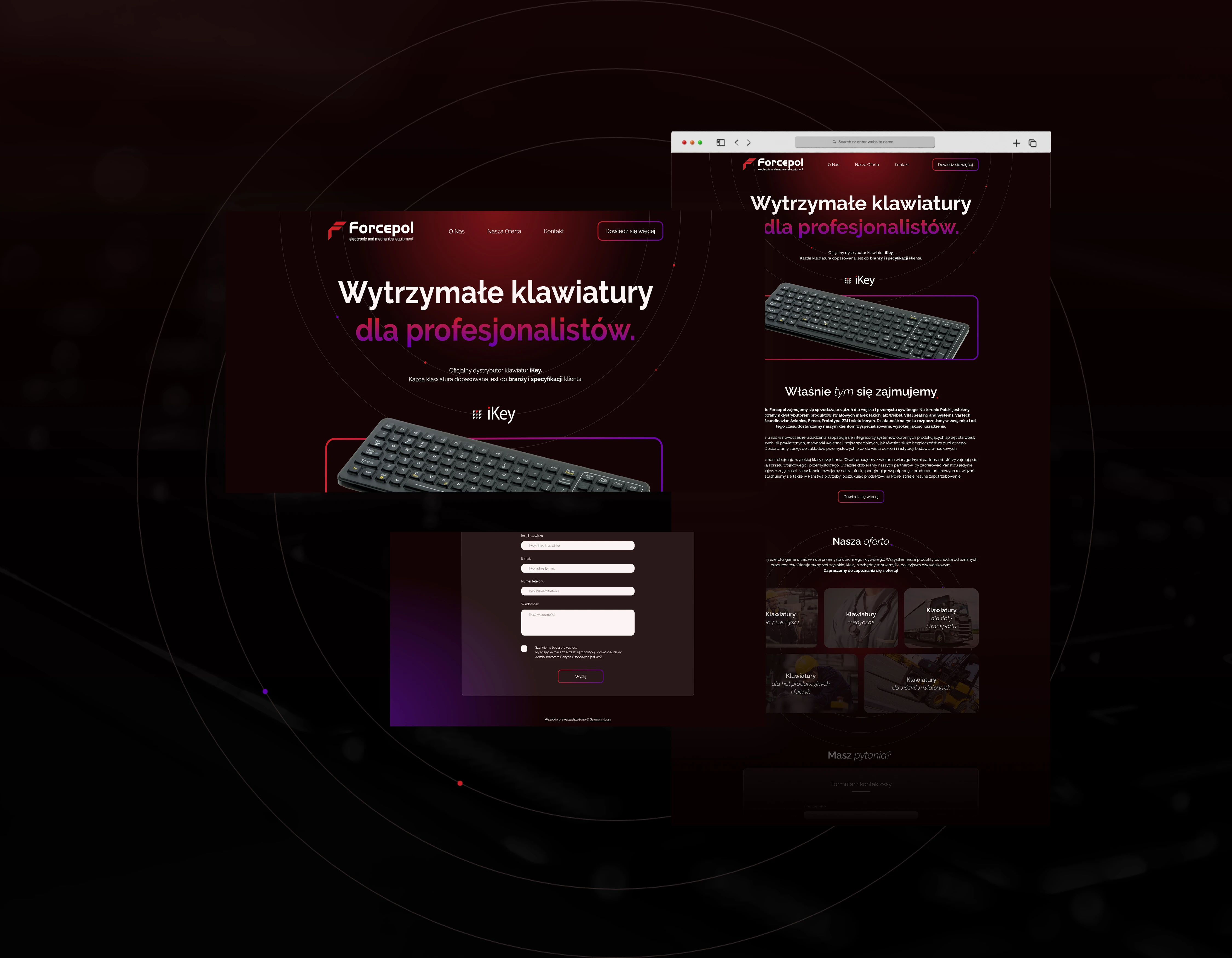
Translating complexity into clarity through design.
The primary goal was to create a product that feels approachable and helpful, even for users with little to no analytics experience. This meant using clear visual hierarchies, friendly color palettes, and intuitive iconography to guide the user through the dashboard. Each design decision was aimed at reducing cognitive load and reinforcing a sense of confidence and control, not confusion.

Solution - design that supports smart decisions.
The goal was to create a tool that truly gives the feeling of control. The design approach focused on readability, clarity, and emotional ease - using calming colors, white space, and simplified charts, while also implementing AI insights to assist users in their decision making.
What about the
DESIGN?
Since the target users are owners of small online stores, the interface had to feel friendly and non-technical. We opted for a clean sans-serif typeface, soft visual contrasts, and a card-based layout that organizes key insights without clutter. The information architecture was built around real user questions, ensuring that users always know what they’re looking at and why it matters. Instead of squeezing everything onto the main view, we introduced a logical flow that guides users step by step - from overview to deeper insight - encouraging exploration without confusion.

Designing clarity for people, not just businesses.
This project aimed to empower small business owners with a product that turns messy data into understandable, actionable insight, while being more cost-efficient than hiring external analysts. Through thoughtful UX, approachable visuals, and user-driven flows, we created a dashboard that feels genuinely helpful. Although the product showed strong initial potential, the project was ultimately cut short due to internal changes in the business processes.