DATE
2/04/2024
Take a look at the modern website created for the optician's store.
Website design for a an optician's store in Bukowno.
Web Design
Full Website
My role
Timeframe
Tools
Deliverables

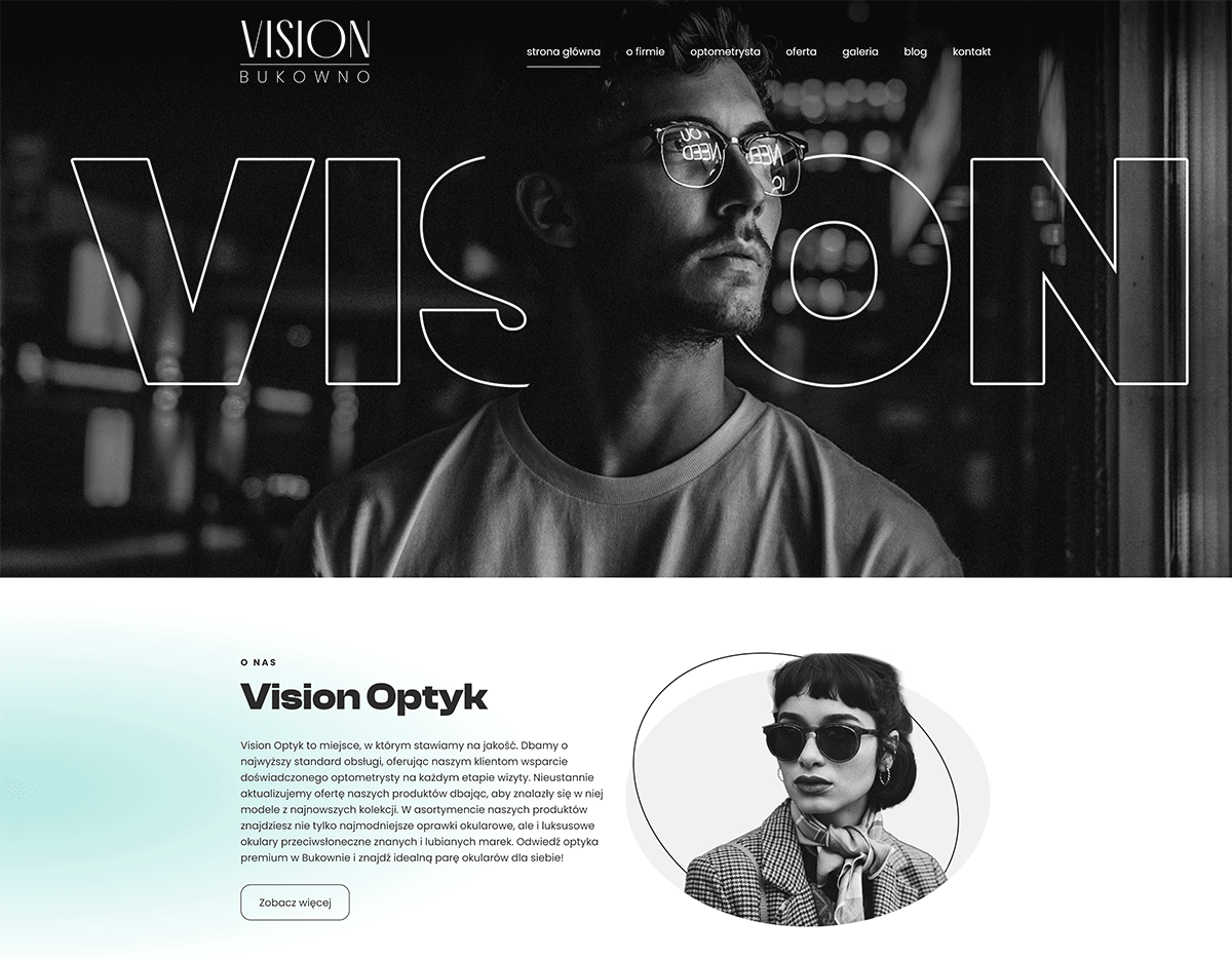
The optician that focuses on quality.
Vision Optyk in Bukowno was created out of the need to offer premium optical services to local residents, featuring frames from well-known brands and the highest quality lenses. To achieve this, the company combines the knowledge and experience of outstanding specialists in optometry and optics with a wide range of carefully selected eyeglass frames.
What were the
GOALS?
• Creating an online presence that confirms expert knowledge and years of experience.
• Designing a website that aligns with the company’s strategy and target audience.
• Enabling future scalability as the company expands its offer and business reach.
Project background: statistics, trends, and key points.
The optical services market in Poland shows a steady increase in demand, alongside evolving customer expectations and competitive pressures. Understanding key industry statistics and trends provides essential context for designing solutions tailored to the needs of modern optical salons.
What were the
FACTS?
• 53% of Poles (around 20 million people) wear glasses.
• The optical market in Poland is forecasted to grow at an average annual rate of 4.37% until 2027.
• Over 10% of stores offer online sales, and the number of purely online retailers is growing.

User Research
After conducting a market analysis, it turned out that the primary audience consisted of individuals looking for high-end luxury brands, rather than those seeking stylish yet affordable eyewear.

Requirements
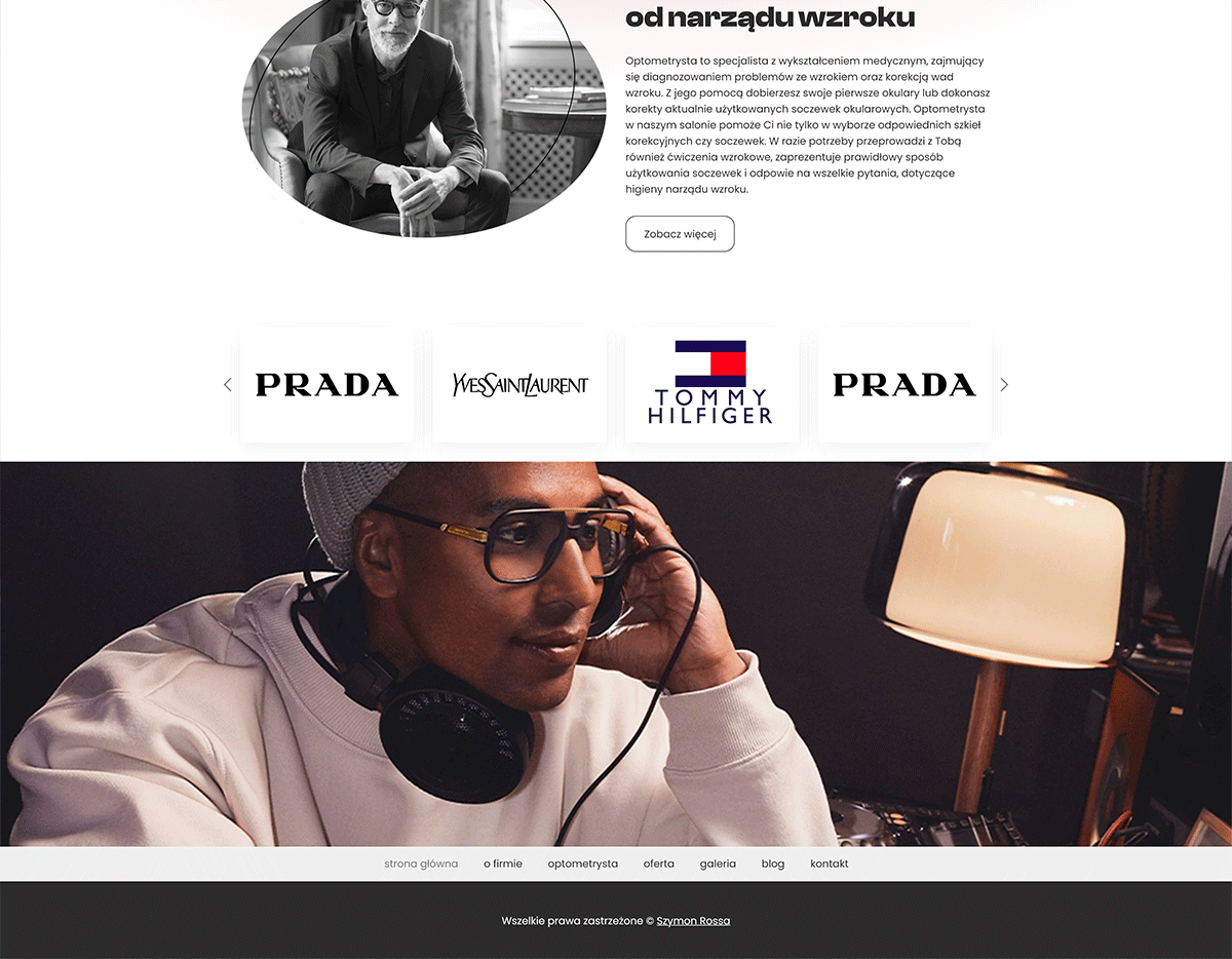
The website had to clearly present experience of the brand, as well as the range of eyewear options.

Assumptions
The assumption was made that providing a blog feature would be crucial in the long-term strategy.

Prototypes
Wireframes were provided, clearly presenting the basic elements of the website as well as the potential user journey.

Analysis & Iteration
The analysis showed that the information architecture should be descriptive, yet not overwhelming, but the most important factors are the visuals.
Designing an online presence aimed at high-end customers is not one of the easiest tasks.
What were the
CHALLENGES?
• Providing information about the company’s products and services in a way that aligns with its premium brand image.
• Implementing a blog to educate and share knowledge on optometry.
• Introducing an easy-to-use content management system (CMS).
Creating an image that reflects the company’s identity and values.
Aligning website design decisions with the customer's image is crucial to ensure consistency across all touchpoints. Every design element, from color schemes to typography, should reflect the company’s brand identity and values. This creates a cohesive experience that resonates with the target audience, builds trust, and strengthens the overall brand perception. By staying true to the customer's image, the website becomes a natural extension of their brand, reinforcing their message and positioning in the market.

Solution - delivering a clear message.
The decision was to create a bright and visually clean design with subtle contrasts, emphasizing clarity and professionalism. This approach aligns with the brand's premium image, ensuring an inviting and modern experience for users.
What about the
DESIGN?
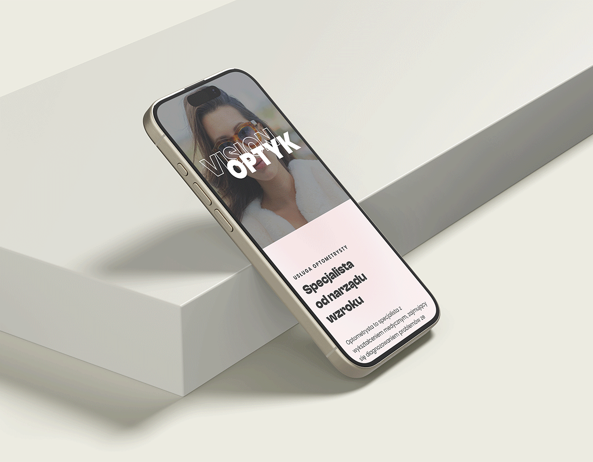
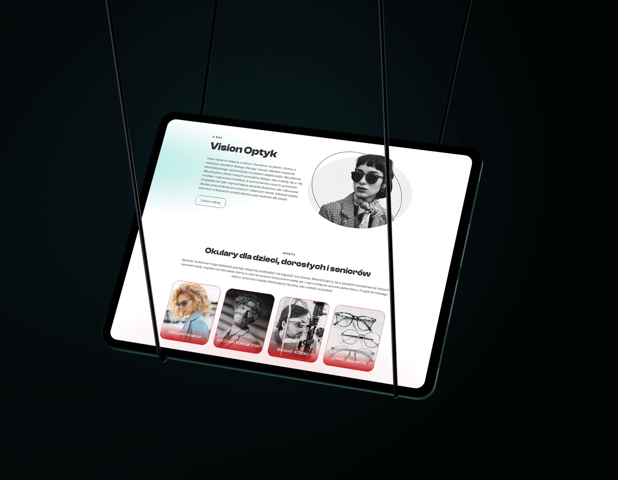
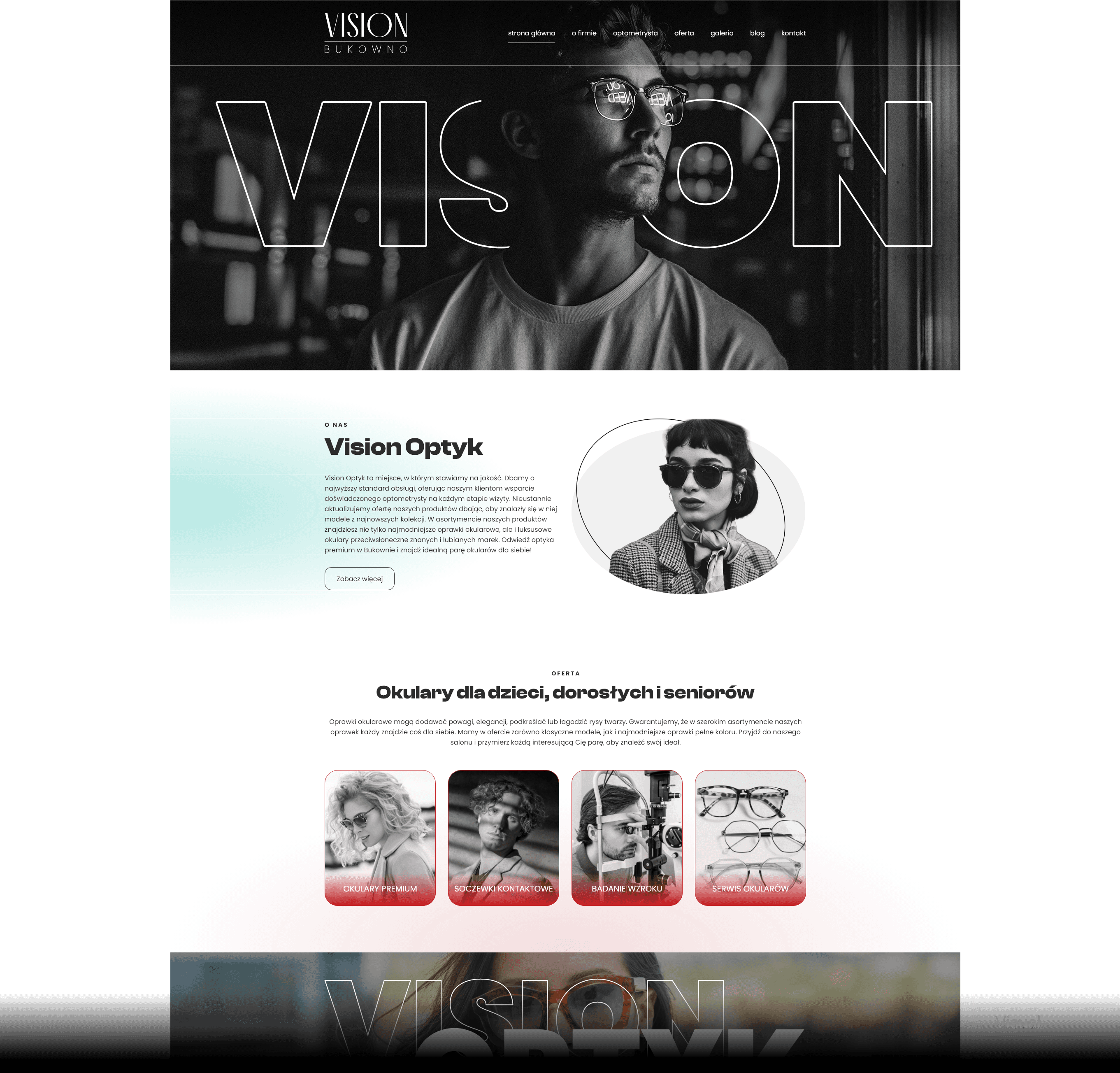
The user at first sight is greeted by a hero section featuring an image that instantly shows a premium brand feel. The entire site is designed in a bright color palette, with black-and-white images complemented by subtle turquoise and red gradients, adding contrast and depth to the style. The fonts used in the headers are grotesque, perfectly harmonizing with the sans-serif typeface in the body text. The finishing touch is the use of outline text elements, which complete the overall layout.
Clear vision, refined design.
Website perfectly mirrors the precision, elegance, and premium quality at the heart of the brand.