DATE
16/06/2024
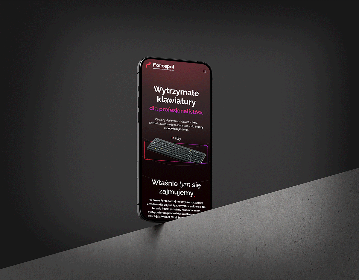
A special page for special equipment.
Website design for a company specializing in the distribution of equipment for the civilian and military industries.
Landing Page
Web Design
My role
Timeframe
Tools
Deliverables
The client is a strong player in the specialized keyboard industry.
FORCEPOL is a company established in 2015, with its main task being to deliver the latest products from around the world to Polish clients in the defense and civilian industries.
What were the
GOALS?
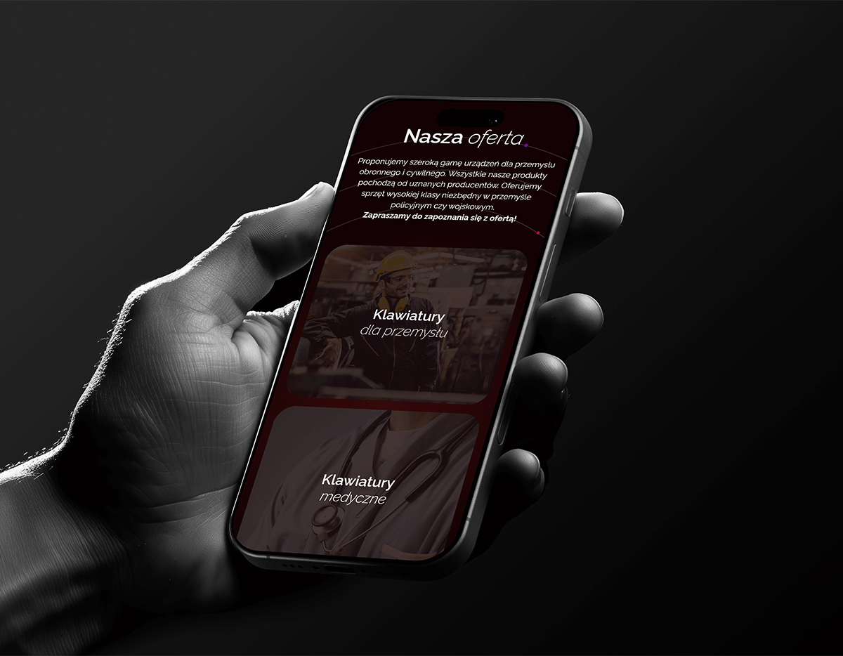
• Providing essential information about the products offered by Forcepol.
• Utilizing existing SEO and redirects.
• The consumer process should end with a generated lead.
Project background: statistics, trends, and key points.
The specialized keyboard market in Poland and Europe shows steady growth driven by rising demands in industrial and medical sectors. Understanding key statistics and market trends offers essential context for designing solutions tailored to the unique needs of professional environments.
What were the
FACTS?
• By 2026, the keyboard market in Europe is expected to reach approximately 1 billion EUR, with a projected annual growth rate (CAGR) of 2.32% through 2029.
• In 2023, Europe accounted for 25% of the global revenue in the industrial keyboard segment.
• The highest demand for industrial keyboards was seen in manufacturing (45%) and the medical sector (25%).

User Research
After conducting a market analysis, it turned out that the primary audience consisted of businesses and industrial professionals looking for high-durability, customizable keyboards for specialized work environments, rather than casual consumers.
Requirements
The website had to clearly show the target industries and use cases of the products.
Assumptions
The assumption was made that modern design would resonate more than keeping it simple.

Prototypes
Wireframes were provided, clearly presenting the basic elements of the website as well as the potential user journey.

Analysis & Iteration
Based on the analysis, it was concluded that users need a clear guidance through the website and the information architecture needs to be a clear path.

A well-executed preparation process was crucial here.
What were the
CHALLENGES?
• Emphasizing the company's maturity along with a modern approach through the use of readable fonts and contrasting gradients.
• Optimizing UX for conversion.
• Adding subtle dynamics in the form of microanimations.
Balancing architecture, UX, and conversion optimization.
Preparation was primarily focused on balancing the implementation of a clear user path, ensuring that the website maintained its professional and modern aesthetic. Additionally, optimizing the website for conversion without compromising its functionality, as well as integrating SEO strategies and redirects effectively, required careful planning and execution to ensure that all elements worked harmoniously and met the client’s goals.

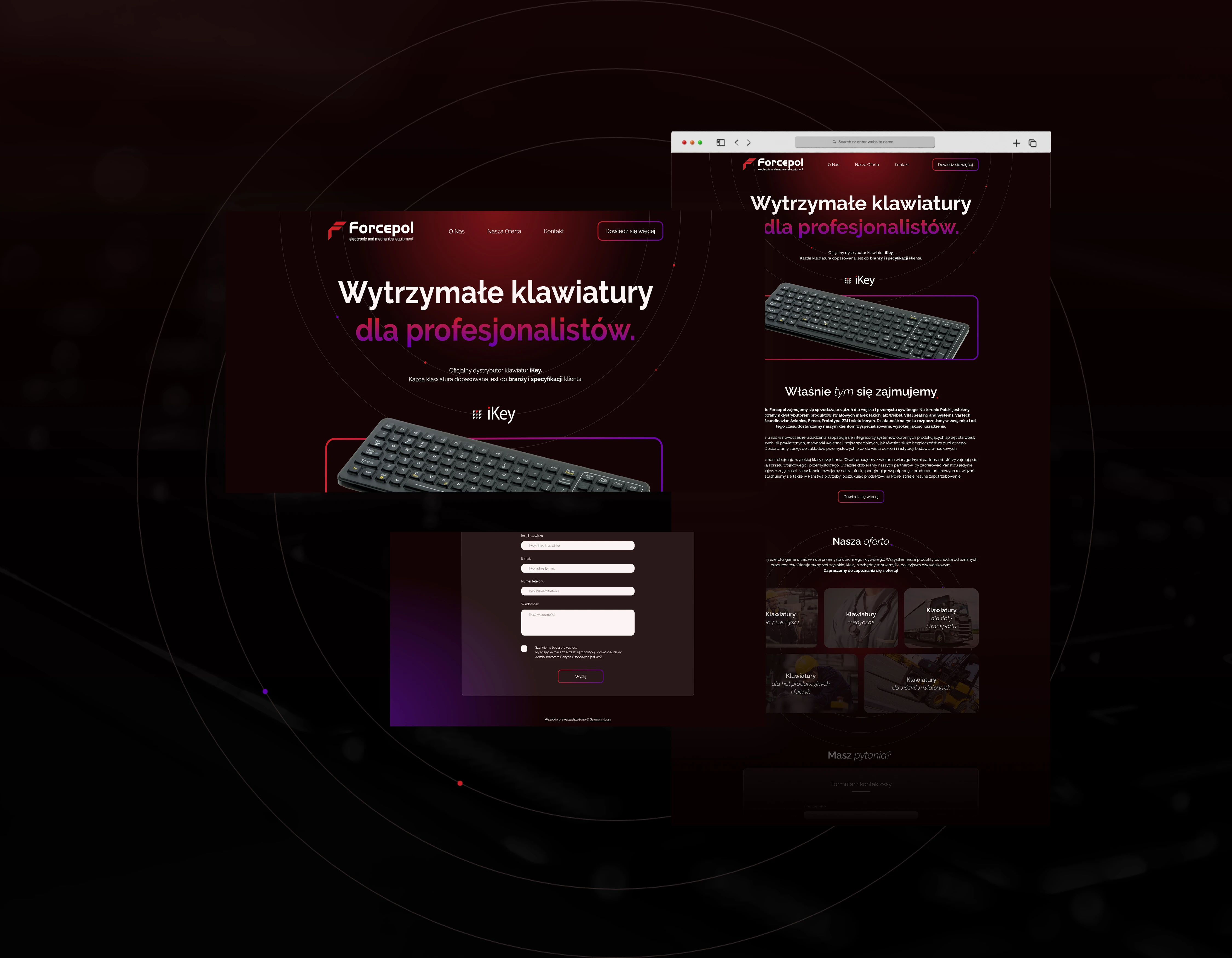
Solution - straightforwardness and simplicity.
The use of vibrant gradients effectively highlighted the company's modernity without compromising the professionalism of the industry. The visitor's journey is linear, culminating in the completion of the contact form.
What about the
DESIGN?
The client’s logo is built using a simple, sans-serif font that is intended to evoke modernity and align with the company’s offer, a concept that has been reflected on the landing page. The use of rounded corners emphasizes the friendliness of the company's proposal and is meant to spark positive emotions. In terms of colors, the logo’s red is complemented by purple, which serves as the complementary gradient shade.

The Forcepol website stands out in its simplicity.
Despite having only a few sections, it distinguishes itself from the competition and most importantly, drives conversions 💪