DATE
13/08/2024
Designing hope and healing through a user-centered website.
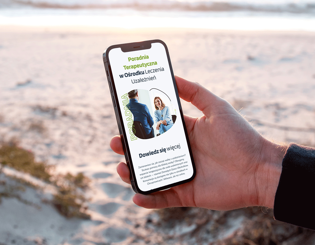
Website design for an addiction therapy and treatment center in Mirków.
Web Design
Full Website
My role
Timeframe
Tools
Deliverables
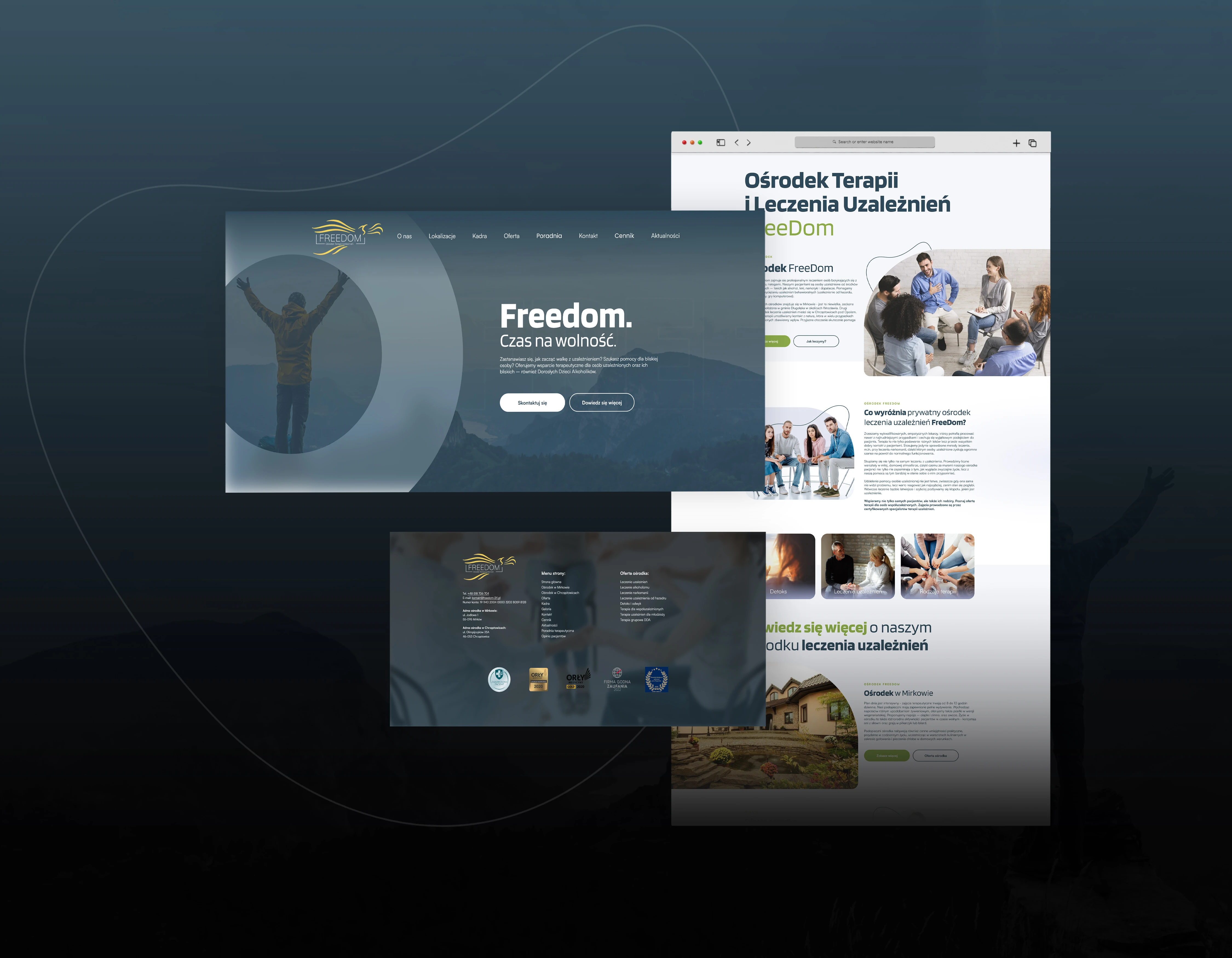
A path to a better life, designed with the user in mind.
The Freedom Center specializes in the professional treatment of individuals struggling with various types of addictions. Their patients include those addicted to psychoactive substances such as alcohol, medication, or various drugs. They also assist in overcoming behavioral addictions, including gambling, internet use, shopping, and video game addiction.
What were the
GOALS?
• Creating a user-friendly experience for individuals potentially interested in the topic.
• Introducing a blog feature to inform about the dangers of addiction and how to prevent them.
• Presenting a sensitive topic in a friendly and engaging way, encouraging interaction.
Project background: statistics, trends, and key points.
The treatment services market in Poland reflects both growing demand and significant systemic challenges. Understanding key statistics and trends provides essential context for designing solutions tailored to the needs of treatment centers.
What were the
FACTS?
• According to data from the State Agency for Solving Alcohol Problems from a few years ago, about 150,000 people with addictions used the services of inpatient and outpatient addiction treatment facilities in Poland annually.
• In the 2023 report by the National Center for Addiction Prevention, it was highlighted that only about 33% of registered patients actually receive modern and effective therapy, due to staffing and facility limitations.

User Research
After conducting a market analysis, it turned out that the larger target group consists of caregivers of addicted individuals, rather than those affected by the problem themselves.
Requirements
The website had to clearly outline the center's offer, and the user journey needed to be smooth.
Assumptions
The assumption was made that building awareness would be more important than conversion itself.

Prototypes
Wireframes were provided, clearly presenting the basic elements of the website as well as the potential user journey.

Analysis & Iteration
Based on the analysis, it was concluded that the best solution would be to minimize CTAs and instead focus on simple navigation.

The design had to be authentic to make it work.
What were the
CHALLENGES?
• Balancing the sensitivity of the topic with the generation of user interest.
• Optimizing content volume for a fast page loading speed.
• Comprehensive exploration of the various topics related to the treatment.
Approaching the topic of addiction treatment in a way that encourages further exploration.
The main difficulty for this project was to approach the topic with complete seriousness, while presenting it in a way that sparks positive emotions. The website needed to reflect the client’s values and their approach to the therapy. It was crucial to include numerous references and emphasize that the treatment center can fully support those in need.

Solution - subtlety is the way.
The foundation of this project was the use of delicacy, applied through soft colors, low contrast between sections, and tying everything together in a non-intrusive way.
What about the
DESIGN?
This project was based on the use of blue and green hues in various shades, designed to spark calm and positive emotions. The typography chosen features a typeface with squarish curves, complementing the simple font used in the body text. Rounded elements were applied throughout the site, avoiding sharp corners, with a subtle outline added in certain places. The low contrast aimed to create a sense of delicacy, without overly emphasized CTA buttons. Given the sensitive nature of the topic, the primary focus was on building trust with the user, with conversion taking a secondary role.

Designing with sensitivity and trust.
The goal of creating a website that guides users on their journey to healing was successfully achieved in this case.